Use coupon code:
  Something exciting is coming soon – stay tuned to find out! 🚀✨
- « Previous blog
-
Grow My Business
-
Dec 11, 2025
-
Dec 22, 2025
-
657
-
0
- Next blog »
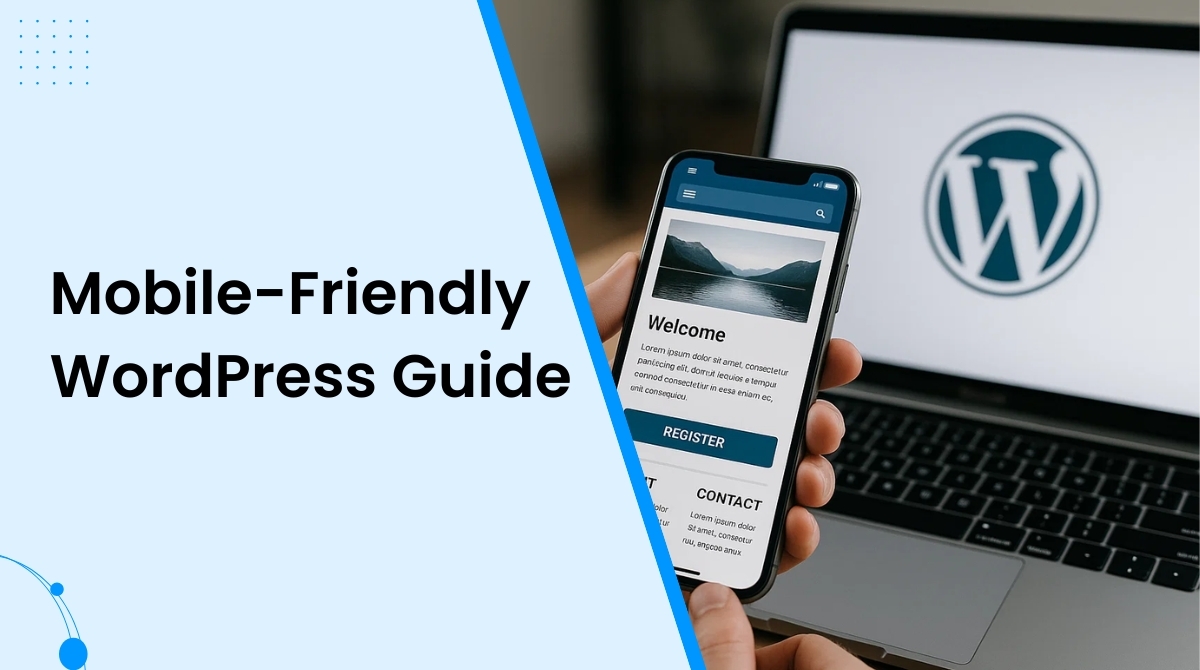
For a website owner, having a mobile-friendly WordPress site is no longer an option; it has become a necessity. Thanks to the growing usage of mobile phones across the world. Most websites on the web are visited through mobile phones, making it essential for you to focus on the mobile experience of your website.
Difficulties in accessing your website on mobile devices not only turns users off but also hampers its SEO ranking. When it comes to Google indexing and ranking, the mobile version of a website is prioritized. Not having a mobile friendly website means compromising on its online visibility, conversion, and engagement.
Whether you are building a brand new website from scratch or revamping the old one, prioritizing its mobile experience guarantees clear design, prominent visuals, fast loading, and great performance on every device.
In this article, you will learn about the essential things you need to create a mobile-friendly WordPress site for your business. Before that let us brief you about the importance of creating a mobile friendly WordPress site.
Why is a mobile friendly website important?
Building a mobile friendly WordPress site makes your website easily accessible to mobile users without affecting its design, quality, or its overall experience.

Here's why a mobile friendly website is important for you:
- Googles web crawlers rely on mobile first indexing which means it gives first preference to the mobile version of your website.
- As people keep browsing websites through their phones, your website gets better scopes for catching audiences attention.
- Users also spend longer time on a website that they visit from their mobile phones than the sites they visit on their desktops.
- They also prefer to make online purchases from their mobiles.
Creating a mobile-friendly WordPress site
1. Begin with checking our site for mobile devices
Before taking any steps to make your WordPress mobile-friendly, you need to check if it actually fulfills all the criteria to be mobile friendly. Instead of doing it manually, go for a suitable tool like Google's Page speed insight tool. It carefully goes through your website pages to analyze core web vitals and measure their performance through scores. In addition to that it will also suggest you ideas to improve the score and your overall website performance.
2. Choose a mobile friendly WordPress theme
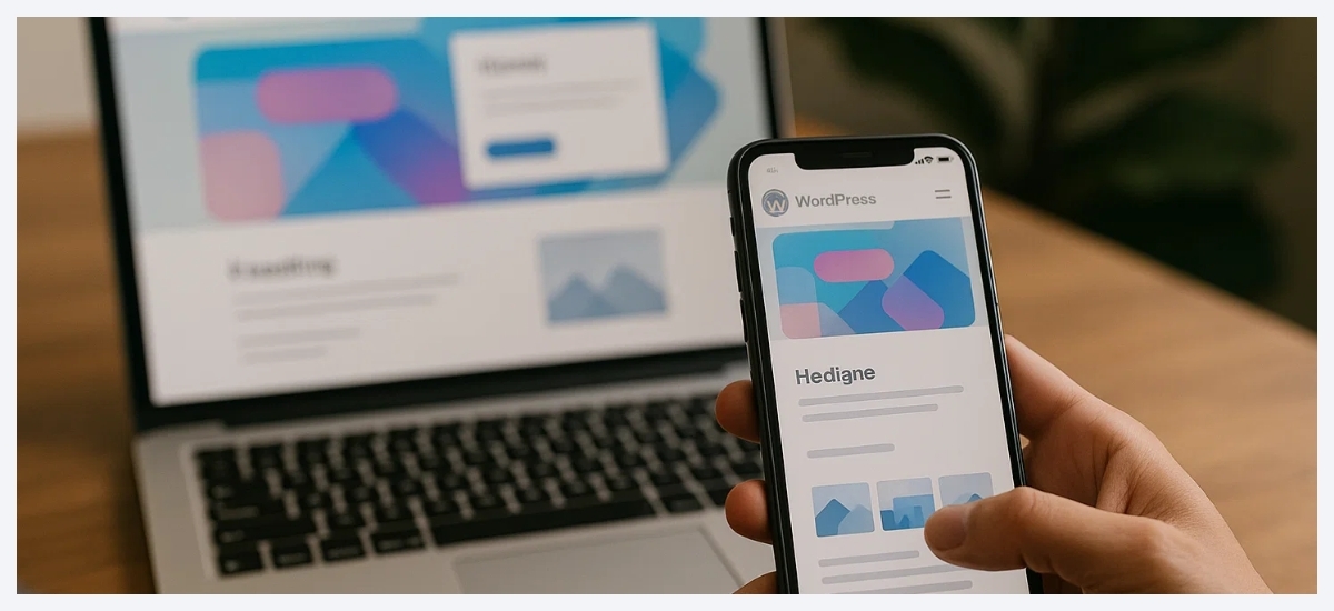
One of the most useful steps to create a mobile friendly website is adding a responsive theme to it according to your brand identity. Most feature-rich WordPress themes come with responsive designs ensuring a high quality website viewing experience in all devices, including mobiles.
For example, if you have an events website, you can opt for the WP Event Manager WordPress event themes that not only offers responsive designs but also cross browsing support, multiple design options and WooCommerce compatibility.
3. Create mobile friendly forms
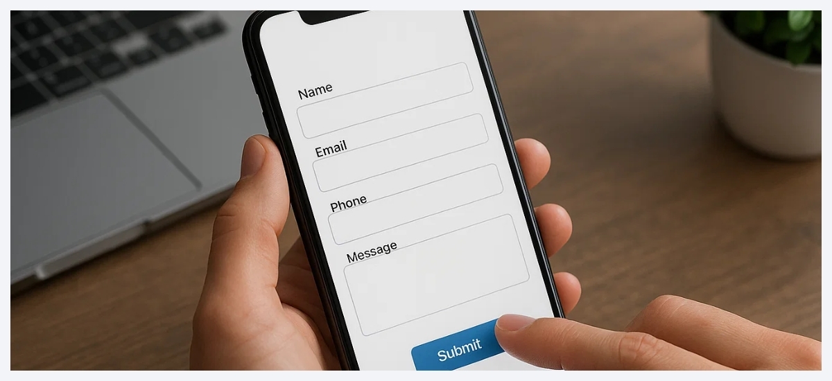
Most websites contain forms that connect them with their audiences like contact forms, registration forms, surveys, etc. Making these forms mobile friendly is essential to encourage people to fill them up because they are most likely to access them on their mobile phones.
Consider the example of WP Event Manager's registration forms that is responsive and ensure the form appears the same on all devices.
4. Prioritize your website speed

Your website speed is not only important for mobile users but for desktop viewers as well. It is an inseparable part of your website SEO as Google considers the page loading time as a major ranking factor. This clearly means that the slow loading page gets a lower rank on Google.
There are various website speed testing tools available for WordPress users like Rank Math that you can use to test your website speed.
5. Make your landing pages mobile responsive

Landing pages play a pivotal role in increasing conversions. That is why your landing page needs to look good on mobiles and desktops. Most website owners rely on a third-party tool for making their landing pages. However, it is important for you to check and confirm if the WordPress page builder you use covers mobile friendly settings. Mobile responsive landing page guarantees better conversion, increased engagement and a prominent brand presence.
6. Focus on content

To make your WordPresss mobile friendly, you need to ensure that the content is placed wisely on the website. Try to avoid huge paragraphs as they make it difficult for mobile users to read them. Mobile users always prefer to go through easy to read content that provides information quickly.
So when you build your WordPress site, or revamp it, make sure you divide the content in small paragraphs and bullet points to avoid the long ones.
7. Use a mobile responsive navigation menu
Responsive navigation menu Is another important element of your website that needs to be mobile-friendly. If the buttons on your website do not work properly on mobile devices, users get frustrated and instantly switch to your competitor's website. The good news here is most WordPress themes offer a responsive navigation menu, but if yours does not offer that, you can create one for your website. Make sure that navigation buttons on your website are prominent, clickable, and redirects to the right page.
8. Make important information easy to find
People usually look for specific information on your website. They might search for the best restaurant in the locality, or the best schools near me, and more. So make sure you provide the right information on your website and add details as much as needed. Do your research and find out relevant keywords, commonly asked questions, etc to ensure that your website perfectly matches their search intent. You can add an FAQ section, relevant videos and images on your website to fulfill this requirement.
Wrapping up
To conclude, we can say that to build a mobile friendly website, you need to focus on its theme, designs, content, navigation buttons, page speed, forms and landing pages. All of these elements need to be reponsive to ensure that your page adapts to all screen sizes with ease.
Frequently Asked Questions
1. Is WordPress good for mobile?
Yes absolutely. WordPress allows users to create mobile friendly websites using responsive WordPress themes, block based layouts and mobile optimized plugins. Additionally, it complies with Google’s mobile first indexing standards, which also helps users with SEO.
2. How to convert a WordPress site into a mobile app?
You need to use a WordPress plugin like AppMySite or any other plugin of your preference to convert your WordPress site into a mobile app.
3. Do I need a special theme to make my site mobile friendly?
Yes, to make you need to use responsive WordPres themes to create a mobile friendly website.
4. Does site speed affect mobile friendliness?
Yes, faster loading websites not only improve user experience on mobile devices but also help with SEO.
5. How can I check if my site is mobile friendly?
It is possible to Check if your WordPres site is mobile friendly using tools like Google’s PageSpeed Insights or mobile-friendly testing tools that analyse your site speed and performance and score them for proper measurement.
About the Author